
Live Preview Download
Spark – Simple and Effective Corporate Website
Spark is a fully responsive one-page HTML5 website template featuring exceptional page-load performance.
Spark is also available as a Fully Featured WordPress Theme: Spark – Responsive & Retina HTML5 WordPress Theme
One site – Multiple displays
Spark automatically adapts itself to the screen size it is seen on. From desktop-level browsers, to tablets and phones (including all iPhone and Android versions), it looks pixel-perfect and makes the best use of the screen it is displayed on – like it would be a native app!
Next-generation features / Enterprise-level compatibility
The HTML5 layout makes use of next-generation features through progressive enhancements: it provides hardware-acceleration display for next-generation browsers and devices, while assuring full enterprise-level compatibility with all browsers, tablets, phones and offers graceful degradation for even older browsers.
Exceptional page-load performance straight out of the box
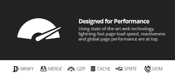
This theme comes with a PHP-based delivery system that will get you – straight out of the box – a Grade-A score at Yahoo! YSlow and a score of 97 (out of 100) at Google Page Speed!
Nothing’s required but a standard PHP web hosting. To name a few of the features packaged with Spark that are providing this kind of performance level:
- Automated JS and CSS minifying and merging
- Gzip of JS, CSS and HTML pages transferred
- Server-side cache of Gzipped version of static files
- Client-side caching rules for static files
- ...
Featured Quote
“This is the best template I have purchased from themeforest!” — Said drakestrategies, 3-4 years of ThemeForest membership, and 50-99 items purchased.

Live Preview
There are 3 color variations:
- Contrasted
- Black
- White
- Here is another example featuring more columns for the Pricing section
Enterprise-Level Features
The concept of this one-page website template is to provide a great experience going from one virtual-page to another, while keeping all the benefits of separate pages (accessibility, browser history, bookmarkable URLs, SEO, and more).
The other great implementation of this design is the flexible, responsive layout. With one website you actually get 3-4 specific layouts for desktops, tablets, phones, and any other devices: The layout adapts itself to what the browser is capable of displaying. Go ahead and resize your browser to its minimum width while looking at the live preview!
Components Synergy
The elements used for building this website were especially chosen to achieve the same goal. The slider featured in this template (FlexSlider) has incredible responsive support and integrates beautifully with the layout, it also provides hardware accelerated CSS3 transitions and hardware-accelerated touch swipe support with standard javascript fallback.
Based on the 960 Grid System (via Skeleton), the template is very easy to use and adapt to your needs. Clear documentation is provided with simple examples.
Featured
- HTML5
- CSS3
- Hardware-acceleration
- Responsive 960 Grid-System (via Skeleton)
- FlexSlider (flexible, hardware-accelerated)
- new! Fixed-header compatible with mobiles and tablets
- new! Responsive Video Support (flexible YouTube video embed)
- Dynamic Menu (updated via scroll position)
- Browser History Support
- Bookmarkable URL
- CDN with local fallback
- Google Fonts
- Natural SEO enhancements (appropriate content tags and HTML structure)
- Ajax Forms with HTML5 fields validation
- Working contact form with newest security features (PHP Filters)
- Page-load speed performance: Grade-A
- new! Dynamic JS and CSS minifying and merging engine
- new! Gzip compression for JS and CSS files
- new! Gzip compression for HTML pages and ajax content
- new! Smart server cache and client cache rules management
- Easy to use CSS image sprites
- Easy to customize colors
- and more…
The PSD files provided allow you to re-use the logo (just change the text) and the sliders (adapt it to your needs by changing the text and the main element). Monochrome icons are provided for both white and black background for all kinds of use. The font used in the demo is “Open Sans” and is also provided.
Please feel free to contact me for any question or comment, I’d love to hear from you!
What People Say
Customer service on this template is amazing. I emailed the author and received a reply right away. Not only that, even when I had other questions the author would respond instantly letting me know when he would get back to me.
Template was very easy to use and like the template author is very ‘responsive’! Recommend his work and support any day of the week!
Thanks again~!
— Paul D.
love the download, well worth the $11! — kokojero
I love the simplicity of this — tamarator
Impressive and slick! — dharmageek
I want to thank you, been waiting for this — rustin
Awesome work! — intakep
Amazing theme very beautifully coded!! — JonnySnip3r
Like everyone else I’m really pleased with your template. Thank you. Great job and I look forward to more from you. — boktoday
Hey I purchased this AMAZING design and codethank you for being someone I feel actually sees the web like I do.
That’s all I have to sayyour documentation and presentation for the package is worth more than what I paid for it, Thanks again!
— Jessy
This is a unique template… really great job of good features. — tamarator
this template is tits!
Nice job JoNa.
I bought it again cause it’s freakin awesome.
— webgraphics
Updates
Your purchase comes with free lifetime updates. Follow me on Twitter to get update notifications.
SPARK RESPONSIVE HTML5 TEMPLATE 11 — June 2, 2013
- Added an IE conditional tag around the
X-UA-Compatiblemeta tag in order to pass the W3C Validdator check as HTML5
SPARK RESPONSIVE HTML5 TEMPLATE 10 — November 16, 2012
- Fixed a specific iOS 5 bug described in this video
Files modified in this version:
/js/main-r9.js— edited
SPARK RESPONSIVE HTML5 TEMPLATE 9 — November 5, 2012
- Improved the technique used for the fixed-header on recent versions of iOS and Android devices in order to prevent visual glitches, speed up the scroll experience, and optimize overall efficiency (less CPU/Battery power)
- Improved the mobile detection algorithm: faster detection and larger coverage — Even more mobile devices are now covered: all versions of iOS, Android, BlackBerry, Windows Phone, Nokia N9, and all other mobile platforms/browsers based on a recent version of WebKit Mobile
- Improved the header structure: the width of the logo is now dynamic – the smaller the logo is, the more space is available for additional menu items
- The mobile version of the logo is now displayed in full size (50px high) in mobile view as the space available allows it
- Fixed an issue where the smooth scroll wouldn’t scroll to the correct position on some mobiles platforms
Files modified in this version:
/js/main-r8.js— edited and renamed to “main-r9.js”/css/main-r8.css— edited and renamed to “main-r9.css”/css/media-queries-r7.css— edited and renamed to “media-queries-r9.css”/js/jquery-1.7.1.min.js— replaced with “jquery-1.8.2.min.js”- All HTML files were edited to reflect the above filename changes
- The HTML code itself was slightly edited (all HTML files): the
<header>element was moved outside the<div id="main">...</div>element, and its internal structure was slightly modified — Watch video
SPARK RESPONSIVE HTML5 TEMPLATE 8 — October 25, 2012
- Introducing fixed-header capability for recent versions of iOS and Android devices
- Added new CSS classes to show/hide content for mobiles, tablets and desktops views
- Updated the PDF documentation to reflect the above
Files modified in this version:
/js/main-r6.js— edited and renamed to “main-r8.js”/css/main-r7.css— edited and renamed to “main-r8.css”/css/media-queries-r7.css— edited- All HTML files were edited to reflect the above filename change
SPARK RESPONSIVE HTML5 TEMPLATE 7 — May 20, 2012
Previous changelogs truncated


Tidak ada komentar:
Posting Komentar